


Find the Moon to Your Star
Why make a pair? One of the topics that scared me the most when I started learning about design was font pairings.
What makes a pair of fonts “work”?
Designers often use font pairings to gather visual interest from their audience and further develop the mood of their brand. For more information about what your font says about you, check out the first post here.
Use Different Fonts Within the Same Family
There's no shame in pairing two fonts within the same family. A family of fonts refers to the different versions of the same font. Font-makers design these typefaces to share the same shapes in a different style.
 In the above photo, both fonts are "Arial" but one is bold and the other is italic. The difference in the representation of the same letterforms provides enough contrasting elements to make them interesting to look at.
This is a safe way to do things, but it doesn't say as much about your brand as a well-executed pairing can.
Distinct, But Not Too Different
The first thing you want to do is decide on a primary typeface. Once you've done that, you'll want to look for its complement.
Like any good relationship, you'll want to search for a font that is different enough from your primary font.
An easy and oft-used way to ensure that your fonts are distinct enough is to pair a serif font with a sans-serif font. You can see examples of it all over. It’s a pretty universal suggestion but it is far from the only way to pair fonts. Further, it does not guarantee that your pairing will look great together.

Here, a sans-serif font pairs with a serif font. A couple of things to note:
- Pay attention to the thickness on the vertical and horizontal axis and you'll see that both are thin on the x-axis and thin on the y-axis. This concept is referred to as a typeface's contrast. This word comes up a lot and is used in a lot of ways, but it's a great way to assess a font.
This can get confusing, but a typeface's contrast is an important measure when considering whether two fonts work together.
- Note that the general shapes of individual letters are similar although they don't share serif-status.
Check Your Work
The critical component of pairing fonts together is to have plenty of contrasting attributes while sharing some characteristics. Things can get confusing to a viewer if the fonts are too similar:
 These fonts are simply too similar to notice the difference between them. While it's not the most egregious bad example, it doesn't serve a purpose and isn't aesthetically pleasing. Remember that you want to invite people to look at your creation as long as possible.
That said, you don't need a difference in serifs to ensure that fonts are different enough.
Here's an example of two serifed fonts that look great next to one another:
These fonts are simply too similar to notice the difference between them. While it's not the most egregious bad example, it doesn't serve a purpose and isn't aesthetically pleasing. Remember that you want to invite people to look at your creation as long as possible.
That said, you don't need a difference in serifs to ensure that fonts are different enough.
Here's an example of two serifed fonts that look great next to one another:
 Let's look at why these work together.
Remember the concept of contrast in the context of fonts? Here, the Elephant typeface features an extreme amount of contrast whereas Garamond is relatively low contrast.
There is a clear distinction between the two, but they also share serifs, letter shapes, and styles.
Let's look at why these work together.
Remember the concept of contrast in the context of fonts? Here, the Elephant typeface features an extreme amount of contrast whereas Garamond is relatively low contrast.
There is a clear distinction between the two, but they also share serifs, letter shapes, and styles.
How Can I Find The Balance?
A heavy font with very thick lettering may look great next to a delicate font with thin lettering, but here are a couple of ways to ensure that the pairing works:
My favorite way to check on a font pairing is to use what I call the “goat method”. You can tell a lot about a font from the letters “g” “o” “a” and “t” because they tend to have the widest variation across different typefaces.
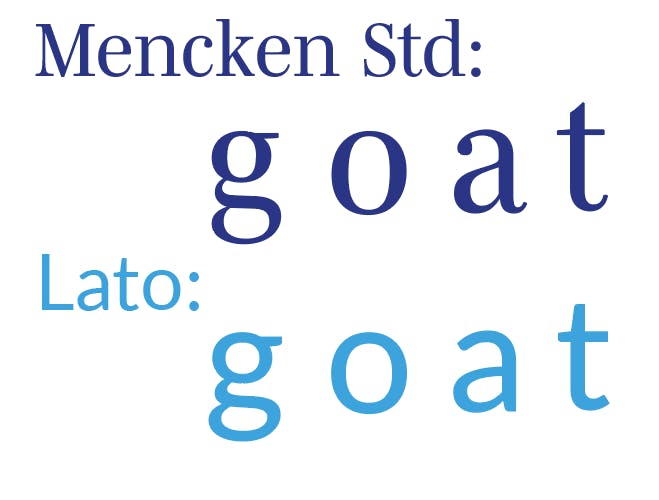
When creating a pairing, I like to see that the goats are similar. If I have chosen a serif font to pair with a sans-serif font, I can ensure that they will look great together by comparing the letters in each typeface.
There's a lot to consider and you might be amazed by the amount of terminology, psychology, and history behind letters.
Choosing fonts is ultimately subjective, but there is opportunity in the lack of rules around it. If you love the way two typefaces look together, you will probably find people who connect with them the same way you do!
I hope this post has been helpful in demystifying the subject a bit. Most importantly, choose a font that reflects the mood being conveyed.
If you’ve found this helpful, leave a comment and let me know!